CPU Performance Reporting with Python
Making sense of cpu performance data for a game can be challenging. Understanding where and how to make optimizations is even harder. However, if we’re able to visualize the performance data you have in a comprehensible way, you can make the process a bit easier. Luckily, there are more than enough Python libraries to help us achieve that.
Introduction
The premise here is that you have some frame time samples collected over the course of a test run, broken down by various categories/systems, and stored in an accessible place (database, csv file, network service, etc.). Depending on the code paths involved, the frame time for each sample may vary widely between frames, but for optimization purposes we’re usually only concerned with outliers on the high end and the central tendency. For central tendency, your median is usually a better choice than the mean as it’s more robust to those same outliers. You’re also going to be primarily concerned where the ‘bulk’ of those frame times fall to get a sense of overall performance for that category. Quantiles make a good measure here. This is often the 25-75% range, or if you’re aiming for consistent performance then something like the 5-95% range may make more sense.
The first step to visualizing this data is our good friend the histogram. This gives a nice overall picture of the frame time distributions and gives us some good initial insight into what’s going on under the hood.
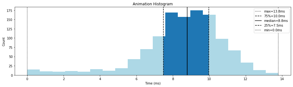
In the example histogram above, the median tells us 50% of our data falls at or below 8.8ms. The 25th and 75th quantiles tell us 50% of our data also falls between 7.5ms and 10.0ms. The worst frame times fall at 13.8ms.
It’s typical to have a budget for each of the categories to give optimization work a target to focus on. In this example, if we budget 9ms of our frame time to animation, we can plot that on our graph to separate it into under and over budget samples.
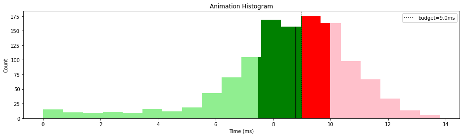
This tells us that we’re doing okay, with 75% of our data less than 1ms over budget. However, that does leave 25% of it in the concerning 10ms+ range. The 13.8ms frame may also be enough to push us below our target frame rate if we don’t have a lot of extra headroom, leading to noticeable stuttering in game. If we’re in the early days of optimization work, this graph tells us we’re on the right track but with some room for improvement.
Creating Graphs
Generating these kinds of histograms is easily done using some off-the-shelf Python libraries created by some great open source projects. The tech stack I’m covering here includes:
- NumPy - numerical methods for manipulating data
- Pandas - handles manipulating data
- Matplotlib - for generating graphs
- Jupyter Notebook - an interactive Python environment that’s easily shared
I won’t go into the details of getting all that up and running, other tutorials cover it in great detail, but suffice it to say you can get most of the way there with:
python -m pip install numpy pandas matplotlib jupyter
jupyter notebook
With the Jupyter notebook up and running, and assuming you can pull your data into a Pandas DataFrame, we’ll move on to plotting it. To create a histogram using matplotlib we do the following:
import matplotlib as mpl
import matplotlib.pyplot as plt

fig, ax = plt.subplots(1, 1) # Create our single plot
N, bins, patches = ax.hist(data_series) # Graph the histogram
Next, to colour the bars of our histogram, according to the style I outlined above, we have to adjust some of the patches.
for index, patch in enumerate(patches):
    # Here LOWER_QUANTILE and UPPER_QUANTILE is set to whatever
    # you'd like. For example, 0.25 and 0.75, respectively.
    upper_quantile_value = data_series.quantile(UPPER_QUANTILE)
    lower_quantile_value = data_series.quantile(LOWER_QUANTILE)

    bin_lower_value = bins[index]
    bin_upper_value = bins[index + 1]

    # Next, we colour each patch based on whether it falls inside or outside our
    # quantiles and whether it's above/below our budget.
    #
    # The helper function 'split_rectangular_patch' (shown below) will split the patch
    # in two if the split value falls within it, colouring each piece accordingly.
    if bin_upper_value < lower_quantile_value or bin_lower_value > upper_quantile_value:
        # Patch is outside quantiles.
        split_rectangular_patch(patch,
                                budget,
                                COLOUR_BELOW_BUDGET_QUANTILE,
                                COLOUR_ABOVE_BUDGET_QUANTILE)
    elif bin_lower_value > lower_quantile_value and bin_upper_value < upper_quantile_value:
        # Patch is inside quantiles.
        split_rectangular_patch(patch,
                                budget,
                                COLOUR_BELOW_BUDGET,
                                COLOUR_ABOVE_BUDGET)
    elif bin_lower_value < lower_quantile_value and bin_upper_value > lower_quantile_value:
        # Patch straddles the lower quantile, so split the patch in two.
        lower_patch, upper_patch = split_rectangular_patch(patch,
                                                            lower_quantile_value,
                                                            COLOUR_BELOW_BUDGET_QUANTILE,
                                                            COLOUR_BELOW_BUDGET)
        # Split each new patch by the budget (if necessary).
        split_rectangular_patch(lower_patch,
                                budget,
                                COLOUR_BELOW_BUDGET_QUANTILE,
                                COLOUR_ABOVE_BUDGET_QUANTILE)
        split_rectangular_patch(upper_patch,
                                budget,
                                COLOUR_BELOW_BUDGET,
                                COLOUR_ABOVE_BUDGET)
    elif bin_lower_value < upper_quantile_value and bin_upper_value > upper_quantile_value:
        # Patch straddles the upper quantile, so split the patch in two.
        lower_patch, upper_patch = split_rectangular_patch(patch,
                                                            upper_quantile_value,
                                                            COLOUR_BELOW_BUDGET,
                                                            COLOUR_BELOW_BUDGET_QUANTILE)
        # Split each new patch by the budget (if necessary).
        split_rectangular_patch(lower_patch,
                                budget,
                                COLOUR_BELOW_BUDGET,
                                COLOUR_ABOVE_BUDGET)
        split_rectangular_patch(upper_patch,
                                budget,
                                COLOUR_BELOW_BUDGET_QUANTILE,
                                COLOUR_ABOVE_BUDGET_QUANTILE)
The helper function split_rectangular_patch is defined as:
def split_rectangular_patch(patch, split_value, below_color, above_color):
    '''Helper function to split a vertical histogram patch'''
    h = patch.get_height()
    w = patch.get_width()
    x = patch.get_x()

    d = (split_value - x) / w

    if d > 1:
        # Patch is completely below split_value, no split required
        patch.set_facecolor(below_color)
        return (patch,)
    elif d < 0:
        # Patch is completely above split_value, no split required
        patch.set_facecolor(above_color)
        return (patch,)

    # Below patch
    patch.set_facecolor(below_color)
    patch.set_width(d * w)

    # Above patch
    new_patch = mpl.patches.Rectangle((split_value, 0), (1 - d) * w, h)
    new_patch.set_facecolor(above_color)
    return (patch, ax.add_patch(new_patch))
Putting this all together, we can quickly generate these histograms for each of our performance data:
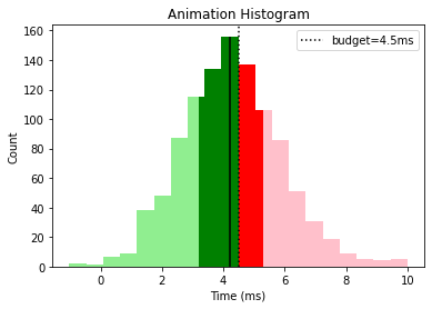
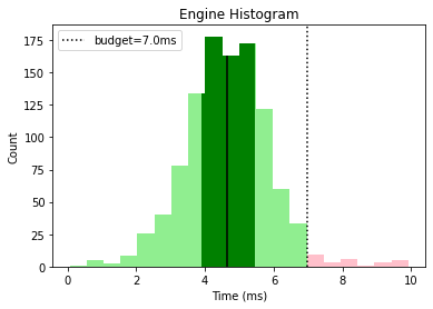
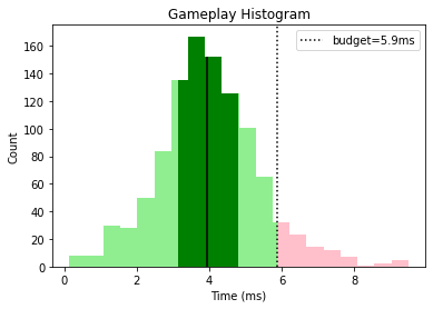
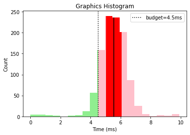
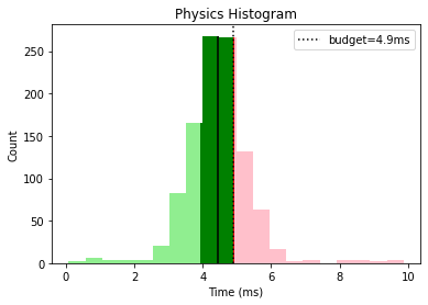
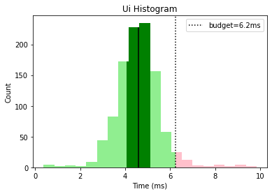
This gives us a nice overall view that tells us that graphics and animation need some optimization work while the other categories are looking good, with a few outliers that could be investigated.
Historical Trends
The next step is to look at the historical trends for these distributions across multiple runs, builds, or platforms. In this example, I’m going to pretend we’ve captured data for the last few builds and are looking to compare them. We can combine multiple histograms by thinking of it like we’re viewing each from above, and then plotting them next to each other:
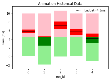
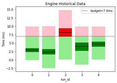
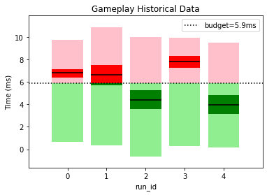
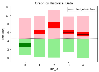
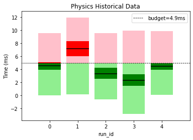
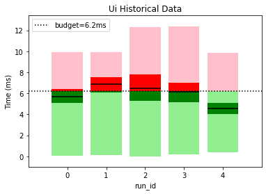
This gives a clear picture of how our performance is varying between builds and lets us know if our optimization efforts are going in the right direction. For example, graphics appears to have had a regression since the first build wheares UI has consistently improved over time. It also helps us spot if performance outliers have been fixed; engine had a spike for run_id=2 but it was fixed in later builds.
Creating the Historical Trend Graphs
Unfortunately, matplotlib doesn’t provide a plot like this by default (boxplot comes close), so instead we’ll build the graph by hand. For each category, we can do something like the following:
# Some configuration values for our graph.
BAR_WIDTH = 0.8
half_bar_width = BAR_WIDTH / 2.0
BAR_TOP_MARGIN = 1

# As always, start by creating the plot.
fig, ax = plt.subplots(1, 1)

# A list of our target quantiles.
historical_quantiles = (0, LOWER_QUANTILE, 0.5, UPPER_QUANTILE, 1)

# I've used a groupby by 'run_id' to create the df_groupby DataFrame.
df_quantiles = df_groupby[category].quantile(historical_quantiles).unstack()

y_min = 1E10
y_max = -1

# Iterate over each row in our data set and create a patch for each
# pair of quantiles.
for run_id, row in df_quantiles.iterrows():
    for lower, upper in pairwise(historical_quantiles):

        lower_value = row[lower]
        upper_value = row[upper]

        if upper_value < budget or lower_value > budget:
            # Single patch, coloured based on above/below budget and above/below quartile
            patch_lower_upper = mpl.patches.Rectangle((run_id - half_bar_width, lower_value),
                                                        BAR_WIDTH,
                                                        upper_value - lower_value)
            if upper_value < budget:
                if lower in (0, UPPER_QUANTILE):
                    patch_lower_upper.set_facecolor(COLOUR_BELOW_BUDGET_QUANTILE)
                else:
                    patch_lower_upper.set_facecolor(COLOUR_BELOW_BUDGET)
            else:
                if lower in (0, UPPER_QUANTILE):
                    patch_lower_upper.set_facecolor(COLOUR_ABOVE_BUDGET_QUANTILE)
                else:
                    patch_lower_upper.set_facecolor(COLOUR_ABOVE_BUDGET)

            ax.add_patch(patch_lower_upper)
        else:
            # Split patch into region above and below budget
            patch_lower_budget = mpl.patches.Rectangle((run_id - half_bar_width, lower_value),
                                                        BAR_WIDTH,
                                                        budget - lower_value)
            if lower in (0, UPPER_QUANTILE):
                patch_lower_budget.set_facecolor(COLOUR_BELOW_BUDGET_QUANTILE)
            else:
                patch_lower_budget.set_facecolor(COLOUR_BELOW_BUDGET)

            ax.add_patch(patch_lower_budget)

            patch_budget_upper = mpl.patches.Rectangle((run_id - half_bar_width, budget),
                                                        BAR_WIDTH,
                                                        upper_value - budget)
            if lower in (0, UPPER_QUANTILE):
                patch_budget_upper.set_facecolor(COLOUR_ABOVE_BUDGET_QUANTILE)
            else:
                patch_budget_upper.set_facecolor(COLOUR_ABOVE_BUDGET)

            ax.add_patch(patch_budget_upper)

    # Add the median for each run as a horizontal line.
    ax.hlines(row[0.5], run_id - half_bar_width, run_id + half_bar_width)

    # Track the smallest and largest y-value so we can set limits later.
    y_min = min(y_min, row.min())
    y_max = max(y_max, row.max())

# I've made some assumptions here that -1 is one less than our smallest run_id,
# and NUMBER_OF_RUNS is one greater than our largest. You'll have to handle your
# own case accordingly.
ax.set_xlim(-1, NUMBER_OF_RUNS)
ax.set_ylim(y_min - BAR_TOP_MARGIN, y_max + BAR_TOP_MARGIN)

# Add budget line
ax.axhline(budget, color='black', label=f"budget={budget:.1f}ms", linestyle=':')

# Use whichever locator makes sense here. I'm assuming integer groups.
from matplotlib.ticker import MaxNLocator
ax.xaxis.set_major_locator(MaxNLocator(integer=True, prune='both'))

# Configure plot
ax.set_title(f"{category.title()} Historical Data")
ax.set_xlabel(GROUP_BY_COLUMN)
ax.set_ylabel('Time (ms)')
ax.legend()
Conclusion
The graphs I’ve outlined here are but one way to visualize CPU performance data, but my hope is this gives an example of a good starting place for exploration. Libraries like Matplotlib provide a flexible way to make great graphs, so whatever your needs for visualization there is probably a way to generate it with these kind of tools.
Source Code
All the source code for generating these plots can be found here: